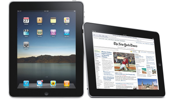
Apple iPhone and iPad are two common mobile devices that people use today. So, it already becomes a necessity for web designers and developers to ensure excellent compatibility. Joomla is one of the most popular content management systems and any website built with it should be optimized for mobile access. Web developers will need to captivate iOS users when delivering a Joomla website. While websites may look less complete on an iPhone, they should become fully functional and appealing on the iPad. We should be aware that websites that are compatible with Internet Explorer, Chrome, Firefox, Opera and even PC version of Safari may not work well on iOS devices.
Apple iPhone and iPad use a special version of Safari browser. It means that designers and developers will need to have both devices to ensure full compatibility. Here are things to consider to make sure that our website could work well on iOS:
- Use HTML5 and JavaScript properly: Validated HTML5 and JavaScript codes should work well on iOS. Although Flash is already rarely used, we should avoid using it, because the format isn’t supported by iOS. A combination of HTML5 markup, jQuery and JavaScript should work well with iOS. They are enough to allow us build well optimized and appealing Joomla website.
- Don’t use mouse hover effect: People sometimes use mouse hover effect when they build Joomla website. However, this won’t work well on iOS devices. The touchscreen display of iPhone and iOS can’t simulate the mouse hover effect. It is often used to indicate the presence of clickable button or link. It is a good idea to use larger buttons and links, instead of the hover effect.
- Use simple and clean design: When creating website for iPhone and iPad, we should use fluid width. This is essential because will use landscape and portrait view alternately. The layout of Joomla website should be flexible. We may need to use different CSS code for both vertical and horizontal layouts. Flexible layout will also work well on devices with different screen resolutions.
- Use view port configuration: With well-configured view port, we will be able to make sure our website is displayed with proper levels of zoom in and out. This is essential when we want to improve user experience on iPhone and iPad when vieweing Joomla website.
- Use CSS3: CSS3 is an improved version of CSS2 and it provides compatibility with many platforms and devices. Latest iOS and Safari browser version fully support CSS3.
- Put important information on the top: We should know that iPhone has much limited screen area compared to iPad and MacBook. It means that we need to make sure that users immediately read important content without swiping down, instead of the header and top navigation area. This should apply for both landscape and portrait orientation. This will make sure that users know whether our website is relevant to the needs or not. Failing to put essential information on top could cause some users to immediately leave the website.


