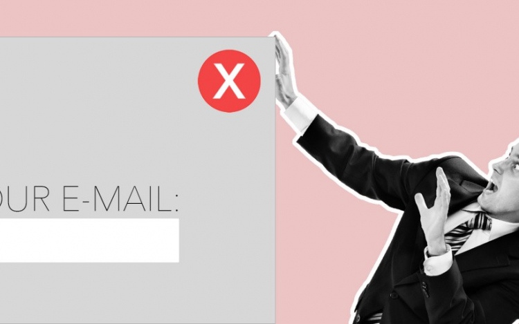
Ask any popular San Francisco, Tokyo, New York or Toronto web Design Company about the growing world of web aesthetics, and you’ll probably hear some overlap. Just like there are hot trends in the fashion world, there are also hot trends in the web design world. One ever-present trend is the pop-up asking website users to sign up or register with their e-mail address.
E-mail addresses are like a form of currency, with each one growing a company’s brand and getting more clicks for their website. Website creators must find creative ways for their clients to collect these e-mail addresses with the right images, aesthetics and verbiage to get users typing.
Imitation is the best form of flattery
A lot of people are imitating similar designs for websites based on what’s popular and on trend. While this does not help your web design stand out, it does train people on how to navigate through your layout and even prepares them for the usual pop-ups.
There are a few things to note with the currently popular pop-up e-mail request form. Yes, it is clever for a health and fitness website to ask if the user wants to be their best self. The user will want to say yes, or they will have a little giggle at the clever question and possibly veto it anyway. But that will only happen the first or second time a website uses this pop-up idea. After that, it will get a bit monotonous for the user. This is where web design companies need to get creative with new ways to request a user’s details, says Kissmetrics (https://blog.kissmetrics.com/capture-email-leads/).
Interrupting the flow
The trend of prompting a user with a clever question to get them to sign up must be timed just right to not interrupt the flow of the user’s experience. If the pop-up occurs too quickly into the website viewing, it can leave a bad taste in the user’s mouth and make them just close the tab. After all, closing a tab is quicker than deciding if the website—which they haven’t even had a chance to look at—is worthy of filling their inbox. On the other hand, if a pop-up occurs right away or even right before closing the tab, that could be a better choice depending on your company’s needs.
Would you want to be forced to stop in the middle of watching your favourite television show to decide whether you want to give the television a piece of your personal information? Probably not. This interruption of website flow might seem minute and not overly important. But in an age where it is so easy to find something else more important to click on, losing even ten seconds of a person’s focus could mean losing them altogether. This is keeping web design companies on their toes to come up with better ways to include website e-mail signups in a creative, seamless way.


