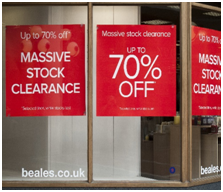
A shop sign says a lot more about your business than you think and can be used as the silent salesperson in your business, so you need to ensure its eye-catching and exciting!
Keep it to the point.
Now, regardless of where your shop sign is going to be located, it needs to be short and snappy, getting your point across straight away. Attention spans have shortened significantly over recent years, hence why you need to keep your shop signage sharp and impulsive otherwise passers-by won’t bother reading it!

Less is more.
Rather than bulking your sign with information, consider using the information that’s going to attract customers to your shop. Do they really need to know how your business originated? Creating a sign for your shop needn’t be complex- in fact, if you keep it short and sweet, it’s more likely to resonate with passers-by, we even communicate using abbreviations, so why not incorporate something similar to your shop sign?
No pretty fonts.
When it comes to fascia shop signage, you want your sign to be clear and visible to people who are walking past your shop but also driving past your shop! Using a font that’s intricate and complicated to readwill not encourage customers to use your business, as they are none the wiser as to what your company has to offer!

Grab the attention of passers-by.
Your shop sign needs to capture people’s attention, otherwise, it’s useless. Your sign needs to be bold and bright if you want it to offer excitement. Help your company to generate a profit! If your sign stands out, customers will choose to use your company rather than similar businesses who have poor signage or no signage at all!
Don’t be scared to use colour.
Not everything has to be black and white. Use colours that customers will associate with your business. Your sign needs to ooze appeal, so why not be daring and use a splash of colour to brighten up your sign? Your fascia shop sign needs to create the right impression and target the right people, and colours can help more than you could envisage!
Bigger is better.
Fonts need to be readable from afar. As we live in an ageing population, increasingly more people are finding it difficult to read text without reaching for their glasses! Large text can target people who are sat trying to occupy their time whilst sat in the rush hour traffic outside your shopfront! A sign that’s readable from a distance is more memorable than a sign that can only be read up close.
Be creative.
Use your imagination to create the sign that speaks volumes to passers-by. For all signage enquiries, consider HFE Signs. When creating a sign, you need to consider the finish of the sign and your budget.
A Foamex sign is the cheapest sign available, however, this has a shorter life expectancy than the Dibond fascia signs. An acrylic sign provides a more luxurious finish, it offers a glass-like finish and is ideal if you’re looking for a professional finish to add to your shop window!
For more information, click here!


